Death to Google Ads! Texans Talk Tip Jar! 🍺😎👍
Thanks for your support!

Texans New Uniforms will debut at Draft.

You need to go back to the many videos and articles and statements that more than make one think otherwise................or is that just part of the FO hype to leave the fan base with a warm and fuzzy feeling about their importance.........

I think the fan council has more important issues to deal with. Like whom the Texans are selecting in the 2nd round.
 
Last edited:
As D-John2008 referenced pages ago, that old English font is used on pretty much everyone’s diploma…high school AND college degrees. I’m assuming everyone here has at least 1 of those. Do/did any of you in here feel like you were graduating from a ghetto street culture school when u received your degrees b/c of that? Likely not. Probably didn’t give it a 2nd thought TBH.

I think the fact that “street culture” & “ghetto” is the automatic go-to when some people see that H speaks for itself in regard to the person TBH.

I’m not a fan of how the H is designed but for me it’s more about not liking the old English font on anything…. period…not necessarily that I think it’s ghetto or representative of some type of unsavory “culture”.

If it’s ugly to you, fine, let it be ugly. But honestly, it’s not any uglier than the previous uni combos…& we wore them shits for 20 years.

Having old English on a diploma is very different than the way old English is used in the way the “street culture” uses it as you describe. Apples and oranges.
 
View attachment 14014

Is an old English letter on a gold chain meant to appeal to Rice alum too?

Marketing a billion plus dollar NFL franchise does not involve random style choices. Every visual decision has meaning.

I'm surprised anyone is even disputing this.

And for the record, I'm actually ok with some of this marketing for apparel. It was just a poor choice to put it on the helmet.
I dunno are you sure that's not John McClain ?
 
I think if the design was on a white helmet it would look better.

And I think this is one big troll job by the Texans.

Not because I hate the design. But I think it would be hilarious.
 
As long as the new uniforms don’t offer blowback like the Texans Letterman Jackets did…..I think I’ll be fine.

For me, the winning new base color would’ve been a Dark Gun Metal Gray Metallic. The same logo in Steel Blue and Battle Red…..just set up on a better background.
Different situations brother. The Texans with the jackets were showing cockiness.

Right now they’re showing a new identity as well as catering to this era’s fashion trends. They’re not the only one making changes to their uniforms. The Jets and Lions revealed their new uniforms as well to name a few. Right here at home both the Astros and Rockets made uniforms changes.
If we’re here another 20 years from now, we might witness another uniform change.
 
Last edited:
Having old English on a diploma is very different than the way old English is used in the way the “street culture” uses it as you describe. Apples and oranges.
The goalposts are moving I see. Because you know where you mostly see that Old E for gang culture? In Los Angeles, you know, where you can’t even wear particular colors or risk being involved in violence. That has nothing to do with Houston, Texas. The low rider culture is MOSTLY prevalent on the West coast, in which that doesn’t always mean someone is in a gang. This isn’t even a thing in Houston because when you see graffiti around town, it is not that. This is not an apples and oranges situation. You choose what you want to interpret from it. The font itself I have shown does not just belong to street gang culture. You will find more diplomas with that font than actual graffiti signs……
 
The goalposts are moving I see. Because you know where you mostly see that Old E for gang culture? In Los Angeles, you know, where you can’t even wear particular colors or risk being involved in violence. That has nothing to do with Houston, Texas. The low rider culture is MOSTLY prevalent on the West coast, in which that doesn’t always mean someone is in a gang. This isn’t even a thing in Houston because when you see graffiti around town, it is not that. This is not an apples and oranges situation. You choose what you want to interpret from it. The font itself I have shown does not just belong to street gang culture. You will find more diplomas with that font than actual graffiti signs……

Can't delete my comment, so how's the weather in Houston today instead??
 
Different situations brother. The Texans with the jackets were showing cockiness.

Right now they’re showing a new identity as well as catering to this era’s fashion trends. They’re not the only one making changes to their uniforms. The Jets and Lions revealed their new uniforms as well to name a few. Right here at home both the Astros and Rockets made uniforms changes.
If we’re here another 20 years from, we might witness another uniform change.

My vision:
BASE- Dark Gun Metal Gray Metallic Helmet / Dark Gun Metal Gray Pants

HM:
Steel Blue Jersey / Dark Blue Facemask

AW:
White Jersey / Dark Blue Facemask

BR:
Battle Red Jersey / Red Facemask

CR:
Dark Gun Metal Gray Jersey / Dark Gray Facemask

TB:
Houston Blue replaces Steel Blue / Red Facemask
 
Blackletter (sometimes black letter or black-letter), also known as Gothic script, Gothic minuscule or Gothic type, was a script used throughout Western Europe from approximately 1150 until the 17th century.[1]It continued to be commonly used for Danish, Norwegian, and Swedish until the 1870s,[2] Finnish until the turn of the 20th century,[3] Latvian until the 1930s,[4] and for the German language until the 1940s, when Hitler officially discontinued it in 1941.[5] Fraktur is a notable script of this type, and sometimes the entire group of blackletter faces is referred to as Fraktur. Blackletter is sometimes referred to as Old English, but it is not to be confused with the Old English language, which predates blackletter by many centuries and was written in the insular script or in Futhorc. Along with Italic type and Roman type, blackletter served as one of the major typefaces in the history of Western typography.

What is Old English font? Old English script was created by Gutenberg way back in 1455. This font, called “Gothic” font back then, was an evolution of his earlier Latin fonts and influenced many other typesetting systems.

Considering how long this font been used throughout history is amazing. To put it in a negative standard based on race or classification is absurd. People of all cultures have embraced this font and how they use it is up to them. It’s not something I would have used, only because there are more modern fonts available. I’m building a website and happen to like new fonts Canva has to offer. Anyway just wanted to share, it’s a great font for single letters, splashy. Looking forward to the draft!
 
Having old English on a diploma is very different than the way old English is used in the way the “street culture” uses it as you describe. Apples and oranges.

u serious? how it’s “used”? What are u trying to say, guys who use the old English font for tats in “street culture” don’t use it to spell actual words in the English language? lol ok…

IMG_0516.jpeg
IMG_0518.jpeg
IMG_0517.jpeg

Your premise is ABSURD..

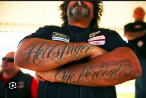
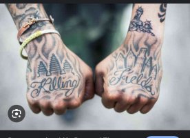
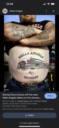
Furthermore we’re not talking about how it’s “used”....we’re talking about the look of it..& u and a few others automatically jumped to where u jumped to without any real deeper thoughts. I know u understand that, you’re just deflecting from the fact that your argument is weak as hell and borderline racist…the old English font is one of the more popular fonts & used in many settings and cultures…doesn’t mean that there aren’t others fonts just as popular in those same cultures. Regular old Helvetica Caligraphy is just as popular in the “street” culture as well…as you can see.
 

Attachments

  • IMG_0515.png
    IMG_0515.png
    618.1 KB · Views: 11
u serious? how it’s “used”? What are u trying to say, guys who use the old English font for tats in “street culture” don’t use it to spell actual words in the English language? lol ok…

View attachment 14023
View attachment 14025
View attachment 14026

Your premise is ABSURD..

Furthermore we’re not talking about how it’s “used”....we’re talking about the look of it..& u and a few others automatically jumped to where u jumped to without any real deeper thoughts. I know u understand that, you’re just deflecting from the fact that your argument is weak as hell and borderline racist…the old English font is one of the more popular fonts & used in many settings and cultures…doesn’t mean that there aren’t others fonts just as popular in those same cultures. Regular old Helvetica Caligraphy is just as popular in the “street” culture as well…as you can see.
None of your pictures look like Old English to me
 
None of your pictures look like Old English to me

That’s sorta the point. “Street” culture dudes or people in or around that lifestyle as they’re trying to pigeon hole the font, don’t limit themselves to the OE font to express whatever it is they’re about in the streets….they use all types.
 
Complete with the asterisk? And that sucks
Yeah but probably not necessary. Just say delete. Make a new post. We usually recognize it’s an edit and stop trying to figure out if you were a truly asking about the weather or not. Know what I mean?
 
As long as the new uniforms don’t offer blowback like the Texans Letterman Jackets did…..I think I’ll be fine.

For me, the winning new base color would’ve been a Dark Gun Metal Gray Metallic. The same logo in Steel Blue and Battle Red…..just set up on a better background.
Too much like titans

Sent from my SM-G965U using Tapatalk
 
u serious? how it’s “used”? What are u trying to say, guys who use the old English font for tats in “street culture” don’t use it to spell actual words in the English language? lol ok…

View attachment 14023
View attachment 14025
View attachment 14026

Your premise is ABSURD..

Furthermore we’re not talking about how it’s “used”....we’re talking about the look of it..& u and a few others automatically jumped to where u jumped to without any real deeper thoughts. I know u understand that, you’re just deflecting from the fact that your argument is weak as hell and borderline racist…the old English font is one of the more popular fonts & used in many settings and cultures…doesn’t mean that there aren’t others fonts just as popular in those same cultures. Regular old Helvetica Caligraphy is just as popular in the “street” culture as well…as you can see.

You missed the point, twisting words and jumping all over the place.

A font used to mark an achievement like a diploma is totally different than the same font used for tattoos, names on back of vehicles, or anything else. Whether it be times new Roman, comic sans or anything else.

You used the term street culture. I just piggybacked on that comment you made.
 
That’s sorta the point. “Street” culture dudes or people in or around that lifestyle as they’re trying to pigeon hole the font, don’t limit themselves to the OE font to express whatever it is they’re about in the streets….they use all types.

They use it differently than any font on a diploma. How you use something is the key point.

Thats the point you are missing.
 
Yep exactly DocB forget the Oilers now no matter which team thinks they have the color n logo. It's past time to turn the new page. I was an Oilers fan Astrodome days since the 60s I lived n loved Houston then and still support the teams now. imho but the logo sucks if you take the baby blue color from that logo then it's like Detroit Tigers logo at first glance lol idk. IF you are determined to add the Oiler blue which here they did then add something similar to or related to oil. I won't lose any sleep over colors and logos and unis but just win the games baby and bring it to H Town
 
You missed the point, twisting words and jumping all over the place.

A font used to mark an achievement like a diploma is totally different than the same font used for tattoos, names on back of vehicles, or anything else. Whether it be times new Roman, comic sans or anything else.

You used the term street culture. I just piggybacked on that comment you made.
No, no. You directly related one particular font to street culture and are now moving the goalposts because it isn’t used strictly in that way, and actually began being used very differently and still is to this day. In POSITIVE ways. Btw, in Houston, it’s called cartels, and they use all kinds of different fonts and symbols.
 
Ehh I disagree..he has ascended to old man curmudgeon status. I always hated our basic ass uniforms. They had nothing to them that made u want to buy gear & They never really represented Houston in my eyes, but rather the target audience of bob Mcnair….which was the older, conservative and quite frankly white male fans. That may have been what Houston was in the 70’s and 80’s but that’s not what it is today. & whether you’re aware of it or not, It is 1 of the most diverse cities in the nation and has many different types of sub cultures that represent it these days.

So while I may not be a fan of some of the elements of this particular design, it is super smart on the part of Cal and the FO to attempt to market and grow the fan base towards ALL of this teams’ fans, not just those who are PERCIEVED to be the target audience and folks that are going to spend the most money.

Our unis have been milk toast and other than the fact that we’ve worn the same bland looking crap for the last 20 years, there really no history of anything there. Haven’t won **** in them. Aside from that, this new alternate design is not nearly as bad as some here are acting like it is.

The logo still looks like it was designed by a 3rd day photoshop hobbiest
 
So you are saying the font itself isn’t directly related to one idea, group or community. That is what I am hearing.

I am saying it’s apples and oranges to say the font is used on a diploma so that makes it ok anywhere and everywhere in any application.
 
No, no. You directly related one particular font to street culture and are now moving the goalposts because it isn’t used strictly in that way, and actually began being used very differently and still is to this day. In POSITIVE ways. Btw, in Houston, it’s called cartels, and they use all kinds of different fonts and symbols.

I related it to that group “street culture” because the poster I quoted used the term and said as much. Then that poster started changing the font being my used and the different groups that use it in different ways.

The fact that people are itching to get offended is interesting to me.

I don’t like the EV drivers either.

Or people who bring their pets into department stores.

I can keep on telling you about groups of people I don’t like.
 
As D-John2008 referenced pages ago, that old English font is used on pretty much everyone’s diploma…high school AND college degrees. I’m assuming everyone here has at least 1 of those. Do/did any of you in here feel like you were graduating from a ghetto street culture school when u received your degrees b/c of that? Likely not. Probably didn’t give it a 2nd thought TBH.

I think the fact that “street culture” & “ghetto” is the automatic go-to when some people see that H speaks for itself in regard to the person TBH.

I’m not a fan of how the H is designed but for me it’s more about not liking the old English font on anything…. period…not necessarily that I think it’s ghetto or representative of some type of unsavory “culture”.

If it’s ugly to you, fine, let it be ugly. But honestly, it’s not any uglier than the previous uni combos…& we wore them shits for 20 years.
I disagree. I think it's a lot worse than the original recipe logo and I wasn't a big fan of that either.

Ultimately it's just another disappointing decision from the front office. Thankfully they seem to be keeping those in the minor details zone and not in the hiring/signing/drafting area like in the old days. The uniforms are "whatever" and that logo looks like some crap a high school kid who smokes a lot of weed would think is cool. If there's a poll posted asking about it I hope it has a "They suck" option.
 
No idea. Finally got that kicked to the curb and here comes a McNair throwing it back to us. "For crying out loud Cal get out of your own way!"
That's what happens when you listen to fans
 
No idea. Finally got that kicked to the curb and here comes a McNair throwing it back to us. "For crying out loud Cal get out of your own way!"
It’s one uniform that does not look or resemble the Oilers. It’s also a popular color regardless, folks will buy it and it appeals to younger fans. There’s three other uniform options so I don’t see the need for all the complaints. If you don’t like it don’t buy it, it’s not going to matter if they are winning…..
 
Houston Oilers fans are alive and kicking. This fan base makes up a rather large portion of the Texans base. I’d be willing to bet that there’s less than a hand-full of Oilers fans that moved their fandom with the Adams Family to Tennessee. So, there are fans that hold sentimental value to the Oilers name and colors…..funny thing, it’s not just the fans, it’s former and current players who also like the Oilers uniforms. It didn’t hurt UH or Rice when they did the Oilers recognition uniforms.

I for one, really like the Houston Texans name, logo, and color scheme…..but it sure would be exciting to see the organization include a throwback uniform that paid homage to the Oilers color scheme in their current look. If done tastefully, past fans would love it and current fans who think the team should never use those colors again would probably come around to a cool new retro colored throwback uniform. Remember, winning makes just about anything look special.
 
I don't care about the uniforms as long as they are pleasing to my eye. And so far, all the rumors and leaks look fine to me. We should wear that special "H" helmet at home once a year for the Titans game while we slaughter them 60-0. And when they wear their Oiler uniforms at home when we are the visitors we'll double that score.

1713709909776.png
 
Eh. Regardless of what anybody thinks of the logo, I just don't think it's going to pop on TV, or even if you're at the game. The bull logo on the steel blue helmets were already not that easy to identify from afar. These don't look like they'll be any better, and may be worse. Put the H in white or if it has to stay what it is use a different color helmet.

The whole thing looks Arena league-ish to me and it does look to be similar to Titans colors, the dark blue with the columbia/Houston/whatever you want to call it blue and red accents. Don't care for that look.
 
Back
Top