Death to Google Ads! Texans Talk Tip Jar! 🍺😎👍
Thanks for your support!
You are using an out of date browser. It may not display this or other websites correctly.
You should upgrade or use an alternative browser.
You should upgrade or use an alternative browser.
Texans New Uniforms will debut at Draft.
- Thread starter Texansballer74
- Start date
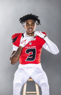
The dark blue tops has been made simpler with shoulder numbering
The number coloring is now dark blue on the white with a "smiling" bulls horn
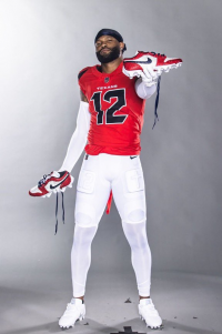
The red top is more orangish.
The light blue trim in the color rush enough to make the little blue H make sense.
Porky
Hall of Fame
I really like the red helmet with the exaggerated half-bull horn...or swoop if you prefer...on each side. So far that's my favorite. I really liked the red helmet look last year and this one is even better imo.
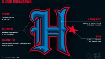
I did see the entire H-town uniform and H helmet. I still don't like it, especially the H font, but it's not as God awful ugly as I first thought. And I actually like the H-town blue color as an accent. Nod to the past Oilers but as has been pointed out, that color represents more than the Oilers. I think you'll either love it or hate it...but I'm in the middle until I see it in action on players on Sunday.
I haven't seen everything yet, but so far...so good. Let's roll!
Texansballer74
The Marine
Love the new uniforms. That dark blue is freaking fire.
Texazan
Our HOF 34
Same here, maybe I'm in the minority here but I like them all, that white with red horn helmet is sick.....Love the new uniforms. That dark blue is freaking fire.
Texazan
Our HOF 34
I think they nailed the use of the blue and glad to see it return, HUGE part of the city history. I never wanted the Oiler unis back but I always wanted them to try and get some of the blue in an alternate......Pleasantly surprised. These uniforms look great! I was worried that the introduction of Houston blue with steel blue would look too much like the Titans jerseys but it’s obvious the Texans didn’t want to go anywhere near there. Also glad they darkened the steel blue.
Texazan
Our HOF 34
I said weeks ago in this thread they could come out in garbage sacks, hardhats and Crocs, IDGAF, just go win and surpass past end of seasons and I'll be happy.....I really like the red helmet with the exaggerated half-bull horn...or swoop if you prefer...on each side. So far that's my favorite. I really liked the red helmet look last year and this one is even better imo.
I did see the entire H-town uniform and H helmet. I still don't like it, especially the H font, but it's not as God awful ugly as I first thought. And I actually like the H-town blue color as an accent. Nod to the past Oilers but as has been pointed out, that color represents more than the Oilers. I think you'll either love it or hate it...but I'm in the middle until I see it in action on players on Sunday.
I haven't seen everything yet, but so far...so good. Let's roll!
Mr teX
Hall of Fame
That’s Fire
Mr teX
Hall of Fame
Love the new uniforms. That dark blue is freaking fire.
Yeah it’s between that dark blue and H-town blue for me…might finally wanna cop some merch now…
BattleRedBlud
Blue Steel Pose. No Excuses!
Love it.
All of it.
Bravo fan council. Bravo Hannah.
Now lets go win some games.
All of it.
Bravo fan council. Bravo Hannah.
Now lets go win some games.
BullRushTX
To'oTo'o A'go-go
The H-town color rush are my favorite of the uniforms, which I did not expect.Pleasantly surprised. These uniforms look great! I was worried that the introduction of Houston blue with steel blue would look too much like the Titans jerseys but it’s obvious the Texans didn’t want to go anywhere near there. Also glad they darkened the steel blue.
That red helmet on the battle red uniforms is pretty badass though.
Nothing wrong with the home and away uniforms either. They have a nice, clean look to them.
BattleRedBlud
Blue Steel Pose. No Excuses!
*spoken with a voice like any character in a Monty Python movie*
...and I say unto thee
With these new threads and their bold new colors
Shall we vanquish the demons of old
To pave a new path towards a destiny written in the stars
Birthed upon cold turf under the watchful gaze of those NRG lights above
We Texans fandom, who bleedeth in battle red glory
Exhalt in the name Houston, in the name H-Town
So may have pride, so we may show dominance
towards all who stand in our way.
Hail Toro. Hail Cal. Hail Demeco and Hail God above.
With this new armor we shall bring forth Champions.
Porky
Hall of Fame
That’s Fire
Ya that's the one that I really like too. I'm not sure I've seen all the combos yet. Are they out on the Texans website or where can we see all the gear?
Mr teX
Hall of Fame
Ya that's the one that I really like too. I'm not sure I've seen all the combos yet. Are they out on the Texans website or where can we see all the gear?
Not sure, but i'm sure you could find it all on their website.
TexansBull
Hall of Fame
The Texans did ok with everything. With anything there is room for improvement. And sometimes people get in the way of the initial goal. Looking at you Amy Stunk Adams.
I think the final design that resembles more of the “love ya blue days” with the white helmet is down the road.
I think the final design that resembles more of the “love ya blue days” with the white helmet is down the road.
TexansBull
Hall of Fame
The H stands for Hannah’s Team.
Let’s be honest.
Porky
Hall of Fame
Guys and gals...go to the URL listed below. It's got everything in exceptional detail with all 4 combos. There are 3 helmets, each with two logos. The side logos of course, and a small one on the rear of the helmet. That's unique, and I like it personally. The traditional helmet is fairly close to what we've had for years. Then you have the controversial city edition H-town "color rush" helmet and uni, and the "bold bull" red helmet and uni combo (my fav). Then standard home and away combos.
There are four overall uniform combos. The more I look at them, the more I like them. Hell, I'm even warming up to the H-town logo now that I see it with the uniform as a package. It's still my least favorite, but it's really not that bad at all. All in all, I am giving this new-look set of logos/uniforms a B+. It's actually above and beyond my expectations. Good job, Hannah!
 www.hs-up.com
There are four overall uniform combos. The more I look at them, the more I like them. Hell, I'm even warming up to the H-town logo now that I see it with the uniform as a package. It's still my least favorite, but it's really not that bad at all. All in all, I am giving this new-look set of logos/uniforms a B+. It's actually above and beyond my expectations. Good job, Hannah!
Houston Texans 2024 Launch
 www.hs-up.com
TexansBull
Hall of Fame
Sam Houston is a Texans fan BTW.
Makes sense.
They will all look good accepting the Super Bowl trophy.
AFC is the road team this year? I guess the Texans will have to wear white. Unless by some miracle the Cowboys make it the Super Bowl.
TheMatrix31
Hall of Fame
Dumb fonts. Unnecessary shoulder ****. "The other" logo on the back of helmets. Cartoony looking outlines and ****. Unnecessary blue. Looks like the Texans versions of Seahawks, Falcons, Jacksoffville etc garbage.
Whatever. What did I expect.
Could be worse.
Whatever. What did I expect.
Could be worse.
Hervoyel
BUENO!
The H-town color rush are my favorite of the uniforms, which I did not expect.
That red helmet on the battle red uniforms is pretty badass though.
Nothing wrong with the home and away uniforms either. They have a nice, clean look to them.
That helmet pretty much makes it work for me. The more I look at it the more I find myself wishing they'd just lean heavily into the red and I find myself agreeing with the sentiment that there are too many dark blue/black helmet-jersey combos out there already. I'd like them to go with red as the primary and use the dark blue as a highlight. "H-Town Blue" I don't see a need for but there's not enough of it to hurt.
A lot of detail about nothing. It's a ridiculously overdesigned "H". I bet it doesn't even stand for "Houston". It was probably the crest on Cal's D&D player's shield.
Mr teX
Hall of Fame
Don't understand the dislike of the numbers....they look like.............numbers  lol........like, there's a little design to them, but they're not so radically different that you can't tell what number they or that they make a huge difference in the look either way. Oh well, can't please everyone. I for one like them all. The FO went for it & they finally look like something with a little style that you could see somewhere wearing away from the game....instead of that boring bland ass unis that we had before...looked like something basic straight out of the 70's. Some folks would likely only be happy if we went back to those old school crop top schimmel joints worn in the 80's..
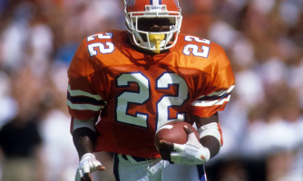
 lol........like, there's a little design to them, but they're not so radically different that you can't tell what number they or that they make a huge difference in the look either way. Oh well, can't please everyone. I for one like them all. The FO went for it & they finally look like something with a little style that you could see somewhere wearing away from the game....instead of that boring bland ass unis that we had before...looked like something basic straight out of the 70's. Some folks would likely only be happy if we went back to those old school crop top schimmel joints worn in the 80's..
Brisco_County
Apples and roadmaps
The unis look great. All is well again.
I think they're fantastic, all around.
The bull logos on the shoulder, the accent color outlining the numbers, the stripes on the pants, the bull horns on the shoulders, the collars much much improved, and the H-town blue (though I thoroughly had my doubts) really pops the right way.
Feels like we're an actual modern team now.
Also I'm pretty sure every player's 40 time is increased just a hair wearing these.
Mr teX
Hall of Fame
Texansballer74
The Marine
Gotta Love Hannah!!
BullRushTX
To'oTo'o A'go-go
Taking no prisonersGotta Love Hannah!!
texanhead08
All Pro
I don't like the H on the helmet I would have liked the logo with the light blue accents instead.
TheMatrix31
Hall of Fame
Despite not liking the presence of the H on back of the primary helmet at all, I must say that the red and black H is significantly nicer than the blue one.
I'd actually consider buying a hat of that if it was red and black.
I'd actually consider buying a hat of that if it was red and black.
banned1976
sleeper mode
I'm not a fashion critic, first and foremost. These uniforms don't offend the senses, nor do they excite me in any way. They're okay. I'll have more of an opinion, or better idea of what I think of them when I see them on the field. If they play good I'll like them more.
Brisco_County
Apples and roadmaps
I cannot stop looking at the Tough Bull red helmet. It's intimidating and cool. If that were paired with the alternate blue jersey, you'd have a perfect uniform.
Brisco_County
Apples and roadmaps
I'm glad they published this info, specifically the fan selection and the bullhorn inspiration. I'm not yet on board with the logo, but I'll keep an open mind. I'm perfectly happy being wrong anytime there's better info or when it's something the fans can enjoy.
Last edited:

