Death to Google Ads! Texans Talk Tip Jar! 🍺😎👍
Thanks for your support!
You are using an out of date browser. It may not display this or other websites correctly.
You should upgrade or use an alternative browser.
You should upgrade or use an alternative browser.
Nike: Outfitters for the NFL and your Houston Texans
- Thread starter le14
- Start date

Premier
Rookie
the crybabies will get over it, upset about the length of the stripes? really? smh. if you cant already see the quality of craftmanship in the nike uniforms maybe you need a closer look. nike>>>>>reebok and its not even a discussion.. however i do think the reebok brand in general might be more popular among the older crowd, which would actually explain alot..
majestrate
Rookie
First World Problems?

GP
Go Texans!
First World Problems?

So true. Rep sent your way. LOL.
SheTexan
Hall of Fame
We have to have something to complain about.
This offseason is a little quiet here. We made the playoffs and won our first playoff game. Other than calling for Jacoby's head, there are not the usual "Fire" this person or this person thread.
Can I start one about Rick Smith?
 Oops!! Not in this thread! I doubt RS had much to do with the uni change. He's to busy f-n up the team!!
BTW! To stay on track! I LOVE the shoes!!
")
TimeKiller
Guest
I was hoping for some incorporation of the Texas flag. Oh well.
We have to have something to complain about.
This offseason is a little quiet here. We made the playoffs and won our first playoff game. Other than calling for Jacoby's head, there are not the usual "Fire" this person or this person thread.
Ahhh . . . remember now, there's no such thing as pissing and moaning and whining and crying here.
We only ..(ahem).. 'discuss'.
 :rolleyes:")
Kaiser Toro
Native Mod
Fire the Flywire designer!
Trail.Blazr
Hooked up to a Kool-Aid IV
Is it me, or does Dre look like he'd rather be anywhere else but there?
TheMatrix31
Hall of Fame
Yeah, we're all so spoiled and ridiculous for complaining that the physical look and identity of our team is changed for the much worse. Stupid.
....at least we're not the Seahawks, I guess.
....at least we're not the Seahawks, I guess.
what's all this crap about new-fangled uniforms made from space-age, lightweight fabrics with built-in padding for player protection, fat stripes on the jerseys, and special, fancy, special V-neck collars..??
In MY day we had skinny stripes on the jerseys and battle red unis that made the players look like walking ketchup bottles and NO padding whatever except shoulder pads...
and that's the way it was and WE LIKED IT!!!
Vinny
shiny happy fan
why is it stupid to not like something? If something changes we are supposed to all agree? I'd consider that kinda stupid. Why are people complaining that fans comment on what they are thinking about? Are we all supposed to have some sort of mass-mind thing going on?Yeah, we're all so spoiled and ridiculous for complaining that the physical look and identity of our team is changed for the much worse. Stupid.
TheMatrix31
Hall of Fame
I just think its dumb that people who don't like the jerseys are labeled "crybabies" and are just "bitching because its the offseason" and that we're just "fashion police" or something.
Like people who care about how the team looks and don't like ugly ass changes to our uniform (see: brand identity) are somehow beneath everyone else.
Like people who care about how the team looks and don't like ugly ass changes to our uniform (see: brand identity) are somehow beneath everyone else.
GNTLEWOLF
Rookie
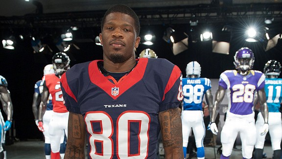
Personally, I don't like the new jersey design. It appeared to me the narrow band around the neck of the Reebok jerseys with the shield at the base of the neck looked more like a medal than the very wid3e band with the NFL shield lost and embedded in the front of the band.
In the photograph of Meyers, I am also struck by how tight the arm bands appear to be.
I'm just not digging the new look. I also hope that the "battle Red" just looks orang because of lighting. I have never been a big fan of what feels to be a copy-cat of the Denver style, and that Orange hugh just makes it worse.
I guess those of us who would have liked more of the old styling will just have to get used to it.
False Start
On # 69
Another thing I noticed, that I just dont like is the height of the numbers on the front of the jersey. Because of the huge collar they had to lower them, and IMO it looks weird.
Look at this pic of Myers, check out how low the front numbers are:


Anyways, lol....
Offsesaon... Damn, come on DRAFT!
Look at this pic of Myers, check out how low the front numbers are:
Anyways, lol....
Offsesaon... Damn, come on DRAFT!
rush2112mn
Rookie
I don't like how they changed the shoulder stripe either. It's been lowered and broadened and it really looks crappy from the side view.
NO way this is an improvement in look. Just look at how classy our look in in the first image...and look at it now. UGH!!!!!!!!!!!!!! FUGLY!!!!!!!!

[/QUOTE
Old vs New......
Looking at both.....I will stick with the old.....
The New Nike version.....looks out of wack......numbers and collar size......
I would have liked to seen a Mean Toro on the sleeves myself.....
Mean Toro.....as in angry eyes and maybe some blood on the horns......
TheMatrix31
Hall of Fame
lol, I didn't even notice how uneven the numbers were on the front and back. Whatta joke.
Blake
MMQB
You can't please everyone. But I ain't gonna fret over collar width or stripe movement. I may actually love the changes when I get used to the new look.
IMO I think some people fear and immediately hate change. Its like a new CD from your favorite band. Sometimes you gotta give it a few pay throughs to digg it.
Sent from my DROID RAZR using Tapatalk
IMO I think some people fear and immediately hate change. Its like a new CD from your favorite band. Sometimes you gotta give it a few pay throughs to digg it.
Sent from my DROID RAZR using Tapatalk
Premier
Rookie
the uniforms are exactly the same, when it comes to brand identity, the width of as collar and some accents arent going to affect that..
as for the "red-orange" crowd, compare the myers and andre pics..

its the combination of lighting and camera quality that produces that red-orange look.... myers photo is a camera phone..
as for the "red-orange" crowd, compare the myers and andre pics..
its the combination of lighting and camera quality that produces that red-orange look.... myers photo is a camera phone..
You can't please everyone. But I ain't gonna fret over collar width or stripe movement. I may actually love the changes when I get used to the new look.
IMO I think some people fear and immediately hate change. Its like a new CD from your favorite band. Sometimes you gotta give it a few pay throughs to digg it.
Sent from my DROID RAZR using Tapatalk
I don't really care about the width of the stripes but a man's number should be worn proudly on his chest, and not be hanging around his midsection. That's just a sorry design.
TheMatrix31
Hall of Fame
Maybe ****ty QBs will be hitting guys "between the numbers" all of a sudden.
Texan_Bill
Hall of Fame
Maybe ****ty QBs will be hitting guys "between the numbers" all of a sudden.

False Start
On # 69
Maybe ****ty QBs will be hitting guys "between the numbers" all of a sudden.
If they throw the balls at their bellys, lol.
TheMatrix31
Hall of Fame
Exactly!
Blake
MMQB
I still dont understand how Reebok is restricted from selling gear before their contract expired.
http://espn.go.com/new-york/nfl/sto...ettle-lawsuit-tim-tebow-new-york-jets-apparel
http://espn.go.com/new-york/nfl/sto...ettle-lawsuit-tim-tebow-new-york-jets-apparel
NEW YORK -- Running for a loss, Reebok has scrapped its effort to sell New York Jets Tim Tebow apparel, agreeing to rid stores of thousands of jerseys and T-shirts it stamped with the quarterback's name after he was traded from the Denver Broncos to the Jets last month.
The terms of a settlement with Nike were disclosed Tuesday in papers filed in U.S. District Court in Manhattan that had been signed a day earlier. It was not clear if any money changed hands.
Tebow
Beaverton, Ore.-based Nike Inc. sued Reebok International Ltd. two weeks ago, saying the rival apparel maker was trying to squeeze the most out of the end of its 10-year NFL apparel licensing deal by stamping Tebow's name on jerseys and T-shirts even though Nike was about to begin a five-year NFL contract of its own.
Judge Kevin Castel immediately blocked Reebok from selling 6,000 Tebow-Jets jerseys and 25,000 T-shirts it was distributing to stores while he heard evidence in the case. After a daylong hearing last week, he left his restraining order in place and announced that he believed Nike would ultimately prevail in its claims.
Reebok had claimed it had permission to sell the jerseys and T-shirts of up to five players who switched teams during March, including Tebow.
Castel on Monday signed a settlement judgment requiring Reebok to buy back from retailers any Tebow apparel it manufactured after its licensing deal with NFL Players Inc. to use players' names and numbers expired at the end of February. Its NFL licensing deal for players' apparel expired at the end of March.
The judgment also blocked Canton, Mass.-based Reebok, an Adidas AG subsidiary, from selling or manufacturing any unauthorized Tebow-Jets merchandise, including what it created in March. The judge then closed the legal case.
Nike spokeswoman Mary Remuzzi said the company was "pleased to have reached a mutually agreeable resolution."
Reebok also said in a statement that it was "pleased to have reached a mutually agreeable resolution."
majestrate
Rookie
I'm all but pulling this out of my ass, because I can't find the article I read when all this first came to light.
IIRC, while Reebok had a contract that allowed them to produce new clothing until 31 Mar, there was a deadline as to when they could bring new designs to market and that deadline was a day or two before the trade to the Jets became official. I imagine that also within that contract, there's something that said Reebok couldn't put a player's name on another team's jersey unless that player has signed a contract with the new team.
IIRC, while Reebok had a contract that allowed them to produce new clothing until 31 Mar, there was a deadline as to when they could bring new designs to market and that deadline was a day or two before the trade to the Jets became official. I imagine that also within that contract, there's something that said Reebok couldn't put a player's name on another team's jersey unless that player has signed a contract with the new team.
False Start
On # 69
I just know, that I will be on the lookout for the Reebok jerseys.
I have all 3 colors of the AJ jersey. I want another white one though, mine is pretty worn. I would like to have all three Foster, OD, Watt, and Demeco.
As far as the Nike jerseys If I do buy one, I'll buy a white Dre, and blue Watt jersey.
I have all 3 colors of the AJ jersey. I want another white one though, mine is pretty worn. I would like to have all three Foster, OD, Watt, and Demeco.
As far as the Nike jerseys If I do buy one, I'll buy a white Dre, and blue Watt jersey.
burro
probably drunk
The new jerseys are ugly with a capital UGLY. The collar looks disproportional and it forces the numbers to the midsection. Oddly enough, they look more like oriental rip offs than some of the oriental rip offs do these days.
That being said, Nike makes better products and in the long run this will probably be better for the players. Still...if those jerseys were prom dates they would be bespectacled fat chicks.
That being said, Nike makes better products and in the long run this will probably be better for the players. Still...if those jerseys were prom dates they would be bespectacled fat chicks.
Last edited:
kwayshauntay
Waterboy
needs wider collars
majestrate
Rookie
fifyneeds popped collars
False Start
On # 69

majestrate
Rookie
Those are "Game" jerseys. You need to look at the "Elite" jerseys (Currently it's #80 or custom; no other players yet, AFAIK) if you want that pimp collar.
$100 vs $250 ($150 vs $300 for custom jerseys)
$100 vs $250 ($150 vs $300 for custom jerseys)
SteveSlaton20
Rookie
Don't like the Nike jerseys... The stripes are weird, the numbers and the "Texans" are too low, right on the belly, and the obvious collars... a bit too big/wide, but I can live with that.
MeLoveTexans
Rookie
They could look like they play for a prison. The Steelers have throwbacks that look like bumble bees or prison uni's.

Theres a handful of Steelers who belong in a prison
They could look like they play for a prison. The Steelers have throwbacks that look like bumble bees or prison uni's.
LOL...
I like those...
False Start
On # 69
They could look like they play for a prison. The Steelers have throwbacks that look like bumble bees or prison uni's.
Holy sh!t! That is some dumb looking gear.
kwayshauntay
Waterboy
They could look like they play for a prison. The Steelers have throwbacks that look like bumble bees or prison uni's.
An easy way to fix this uni is to give it an extra wide collar, obviously.
Make it hideously wide enough, and it just might take attention away from the stripes.
Hmm which, come to think of it, suggests a converse fix for the Texans' wide collar: put red and blue prison stripes on the Texans' uni. Nobody will notice the wide collar then.

kwayshauntay
Waterboy
Because if you're gonna go ugly, why stop just halfway? Go all the way ugly, I say!
Mr teX
Hall of Fame
They could look like they play for a prison. The Steelers have throwbacks that look like bumble bees or prison uni's.
That **** is terrible.