Keep Texans Talk Google Ad Free!
Venmo Tip Jar | Paypal Tip Jar
Thanks for your support! 🍺😎👍
You are using an out of date browser. It may not display this or other websites correctly.
You should upgrade or use an alternative browser.
You should upgrade or use an alternative browser.
Glitter Kittys get new uni's.......
- Thread starter Big Lou
- Start date
Kulluminatii
Veteran
What the hell were they thinking?? 
hot pickle
Canada Eh
I like em too. gonna be interesting to see if the texans do a makeover in the next few years
TheIronDuke
All Pro
I guess if you're gonna play like a college football team you might as well look like one.
eriadoc
Texan-American
I guess if you're gonna play like a college football team you might as well look like one.
Perfect.
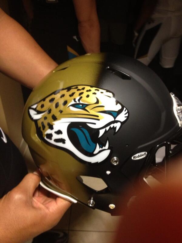
Another helmet pic. To me it looks like some kid spray painted it. I am surprised the NFL signed off on this.

.
.
.
.
.
.
.
.
.

.
.
.
.
.
.
.
.
.
The Pencil Neck
Hall of Fame
Are the helmets two-tone or do they change with the lighting?
The helmet in the first picture looks all gold.
The helmet in the first picture looks all gold.
Are the helmets two-tone or do they change with the lighting?
The helmet in the first picture looks all gold.
No, look closely. Its has the black on it. Hard to see with the lighting
Tailgate
Fall of Hame
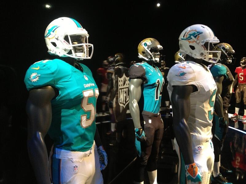
Fins and Vikes leaked too
https://mobile.twitter.com/UniWatch/status/326770731927093249/photo/1
I wonder how bad ass our unis would look With a matted helmet? And take the pj lookin coller around the neck thing out. More clean and modern?
https://mobile.twitter.com/UniWatch/status/326770731927093249/photo/1
I wonder how bad ass our unis would look With a matted helmet? And take the pj lookin coller around the neck thing out. More clean and modern?
Lurvinator11
Veteran
I like em too. gonna be interesting to see if the texans do a makeover in the next few years
No. Our Uniforms are good the way they are.
They still look like... :removes glasses: Jag-off's.
Fixed it for ya LOL. I do like the black and gold helmet. Should have been more gradual tho
powda
The bridge between stupid and useless is short.
No. Our Uniforms are good the way they are.
Except for the ketchup top and bottom combo.
False Start
On # 69
i like the simple, retro looking unis (giants, 9ers, packers etc.) much more than these newer designs. every year they make them look more and more like arena league unis.
Exactly
The Jags....

The Dolphins look alright, and the Vikings going retro is cool.
chicagotexan2
Easterby = Little Finger/Cal = Fredo Corleone
Remember those tacky pickups from the 90's with the 2 tone paint jobs that looked crap? Same concept. Makes sense I guess I bet the mullet and z cavarrichis are still popular in Jacksonville too.
Remember those tacky pickups from the 90's with the 2 tone paint jobs that looked crap? Same concept. Makes sense I guess I bet the mullet and z cavarrichis are still popular in Jacksonville too.
You don't see those paint fades on trucks these days, but least when you do they are even and gradual, which would not describe those helmets!
GP
Go Texans!
Remember those tacky pickups from the 90's with the 2 tone paint jobs that looked crap? Same concept. Makes sense I guess I bet the mullet and z cavarrichis are still popular in Jacksonville too.
I think that the half-gold and half-flat black helmet was just to show the two paint schemes but on the same helmet.
There's another photo where the entire helmet is gold.
There's no way they would do something so dumb looking. Then again, they put black tarps on empty spectator sections in their stadium...and have two guys in their war room.
I think that the half-gold and half-flat black helmet was just to show the two paint schemes but on the same helmet.
Why wouldn't they just show 2 different helmets? If what you're saying is true that is pretty cheap and pathetic.
The Pencil Neck
Hall of Fame
I think that the half-gold and half-flat black helmet was just to show the two paint schemes but on the same helmet.
There's another photo where the entire helmet is gold.
There's no way they would do something so dumb looking. Then again, they put black tarps on empty spectator sections in their stadium...and have two guys in their war room.
On the NFL network, they're saying it's a two-tone helmet.
GP
Go Texans!
Why wouldn't they just show 2 different helmets? If what you're saying is true that is pretty cheap and pathetic.
On the NFL network, they're saying it's a two-tone helmet.
OK, so after reading you guys' posts...and going back and looking at the photo again...I can now see that in this photo it DOES fade to black just in front of the jaguar's mouth.
My bad. I had thought that the darkness in that area was just lack of lighting.
That's pretty much a fugly design. I'm in the wrong business...I should be re-designing football helmet paint/design schemes. I don't know how this stuff gets past all levels of decision making in an NFL organization. At some point, shouldn't someone, somewhere, stand up and say "We can't fade a gold color to a black on the helmet. One or the other, but not both."???
Sheesh.
htownfan32
Hall of Fame
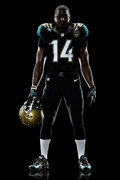
Except for the ketchup top and bottom combo.
But the ketchup top with the blue pants looks badass. Try it in Madden for confirmation.
htownfan32
Hall of Fame
And as for classic vs. new unis... well, the Seahawks have nice new unis, but they have nice colors to go with too (not the ugly neon green, but Nike used that properly as an accent rather than a primary color) and Nike didn't go overboard with those.
I just don't like the palette the Jags have to work with. I hate gold, teal is situational, and black is okay. But the helmet looks like crap, though the black jersey is actually pretty decent (teal being an accent instead of a primary color)
I just don't like the palette the Jags have to work with. I hate gold, teal is situational, and black is okay. But the helmet looks like crap, though the black jersey is actually pretty decent (teal being an accent instead of a primary color)
Definately a 2 tone helmet as seen in the NFL uniforms leak photo. I don't like the Dolphins either. They should have stuck with the aqua blue facemask and from this photo is looks like they took the orange away from the helmet stripe. The logo is pretty lame also. I see a lot of Dolphins stuff on cars around here, I wonder how many are going to be updating to the new logo.
infantrycak
Hall of Fame
Definately a 2 tone helmet as seen in the NFL uniforms leak photo.
I may be having a brain fart but are there any teams that have two different color helmets, by that I mean two separate helmets, which they swap out with their uniforms?
The Pencil Neck
Hall of Fame
I may be having a brain fart but are there any teams that have two different color helmets, by that I mean two separate helmets, which they swap out with their uniforms?
Only with their throwbacks, I think.
The Pencil Neck
Hall of Fame
OK, so after reading you guys' posts...and going back and looking at the photo again...I can now see that in this photo it DOES fade to black just in front of the jaguar's mouth.
My bad. I had thought that the darkness in that area was just lack of lighting.
That's pretty much a fugly design. I'm in the wrong business...I should be re-designing football helmet paint/design schemes. I don't know how this stuff gets past all levels of decision making in an NFL organization. At some point, shouldn't someone, somewhere, stand up and say "We can't fade a gold color to a black on the helmet. One or the other, but not both."???
Sheesh.
Hey, I was the same way at first. I saw that picture and thought the helmet was completely gold. But someone told me to take a closer look and... yeah. That's fail.
Here's some more shots of it:


Horrible .. if you are going to do a 2 tone have the gold in front and the black in back. That way you can say the Jag is coming out of the shadows. The way it is now you can just say the Jag is fading into the darkness (which is appropriate).
They could have went with the gold with black jaguar spots (ala Bengals) and keep the logo where it is.
They could have went with the gold with black jaguar spots (ala Bengals) and keep the logo where it is.
The new unis themselves are not bad, but the helmet is hideous. It looks bush league, and like Hookem mentioned, I'm surprised it was approved by the NFL.
This is awful. Worst uniforms in the NFL without any doubt in my opinion.
Arena ball uniform.
In my opinion, the Titans have the ugliest uniforms in the NFL
Also, for the record, I really hate the Dolphins new logo and uniform.
Doppelganger
None
It looks like somebody just took a yellow spray-paint can to a black helmet.
Looks like someone took a yellow spray paint can and ran out half way through!
False Start
On # 69
Remember those tacky pickups from the 90's with the 2 tone paint jobs that looked crap? Same concept. Makes sense I guess I bet the mullet and z cavarrichis are still popular in Jacksonville too.
Yeah I do. I was like 11-12 ,and even then I was like
 They had the woodgrain, with the fluffy velour seats. They were the equivalent of customized Vans.
chicagotexan2
Easterby = Little Finger/Cal = Fredo Corleone
It looks like somebody just took a yellow spray-paint can to a black helmet.
But ran out of yellow spray paint. I'm in the wrong business too, this is ugly. Teal isn't that tough looking but the old unis look way better than this hack job.
chicagotexan2
Easterby = Little Finger/Cal = Fredo Corleone
Yeah I do. I was like 11-12 ,and even then I was like
It wasn't even nice wood grain on the interior it was like lacquered 2x4's just slapped on the dashboard and arm rests.
Here is a better picture of the helmet in the natural sun light. Much better than the terrible lighting they had at the reveal @ Everbank. http://i.imgur.com/GwrMQA4.jpg
I do like the new uniforms, the helmet should have been all gold or matte black.
I do like the new uniforms, the helmet should have been all gold or matte black.
The Pencil Neck
Hall of Fame
Here is a better picture of the helmet in the natural sun light. Much better than the terrible lighting they had at the reveal @ Everbank. http://i.imgur.com/GwrMQA4.jpg
I do like the new uniforms, the helmet should have been all gold or matte black.
My god. That's even worse.
infantrycak
Hall of Fame
Here is a better picture of the helmet in the natural sun light. Much better than the terrible lighting they had at the reveal @ Everbank. http://i.imgur.com/GwrMQA4.jpg
So in the sunlight it looks like Bondo?
Here is a better picture of the helmet in the natural sun light. Much better than the terrible lighting they had at the reveal @ Everbank. http://i.imgur.com/GwrMQA4.jpg
I do like the new uniforms, the helmet should have been all gold or matte black.
I love that Helmet and it looks much better in the light...