Another one of these things.
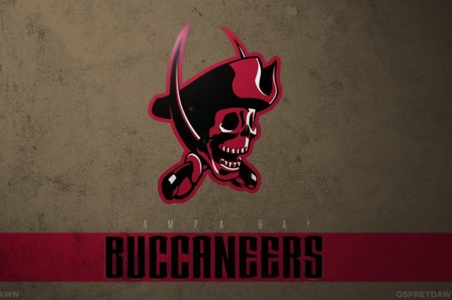
The Tampa Bay, Washington and Atlanta logos are the coolest.
http://bleacherreport.com/articles/...erral&utm_campaign=cnn-sports-bin&hpt=hp_bn15
The Tampa Bay, Washington and Atlanta logos are the coolest.
http://bleacherreport.com/articles/...erral&utm_campaign=cnn-sports-bin&hpt=hp_bn15