This will suck. I've always like the Dolphins logo.
http://www.nfl.com/news/story/09000...o-change-for-13?campaign=Facebook_atl_sessler
http://www.nfl.com/news/story/09000...o-change-for-13?campaign=Facebook_atl_sessler
Keep Texans Talk Google Ad Free!
Venmo Tip Jar | Paypal Tip Jar
Thanks for your support! 🍺😎👍

Old:

New:
I like the old one more. It's cartoony and funny. Maybe someone should call Ace Venture to save Snowflake again!
I like the new logo....it looks more modern...just hate to see it happen to a banner franchise like them.

Old:
New:
I like the old one more. It's cartoony and funny. Maybe someone should call Ace Venture to save Snowflake again!
Ok I assume the Dolphins pay big bucks to the markerting dept. but this or anything similar to this is weak. It looks like a logo that a Jet Ski maker would use.

Ok I assume the Dolphins pay big bucks to the markerting dept. but this or anything similar to this is weak. It looks like a logo that a Jet Ski maker would use.
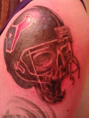
Hearing news about franchises changing their logos make me really worried about the future of my Texans logo I got tatted a couple of months ago.
That said, the Dolphins old logo was awful.

Besides the Oilers I grew up rooting for the Bucs. Mainly because I really loved the orange/red/white colors and the Bucco Bruce logo. When I was a kid I had an orange Doug Williams jersey, Bucs logo backpack, watch, etc.
I initially hated it when they changed, however the new Bucs get up is pretty cool and more "pirate" looking.
I guess my point is IF you are going to change from something traditional it better be pretty darn awesome.
For example, the current Patriots uniforms are horrible, especially their John Kerry looking logo. The old logo was pretty cool IMO.
I wish I could remember the name of the comedian I was listening to the other day on Sirius radio. He was talking about football fans and he was going on about how he is a Carolina Panthers fan and that every time the Panthers make a first down, the sound system blares out an angry panther growl. He figured that at Dolphin games, there should be a dolphin squeaking sound after every first down. He mimicked a dolphin sound and it was hilarious.
I always thought the whole Dolphin theme was pretty lame for a football team. Why not something mean like Sharks?
Why not something mean like Sharks? However now that I live in Florida and get the "vibe" here the Dolphins thing makes more sense now.

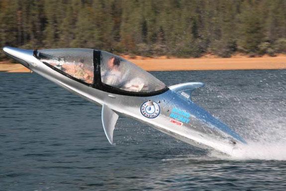
Well, the way they've been playing... I'd suggest something like this:

Ok I assume the Dolphins pay big bucks to the markerting dept. but this or anything similar to this is weak. It looks like a logo that a Jet Ski maker would use.


Incorporate a player's number into the logo, then you never have to worry if the Texans change theirs. It'd be considered a tribute tat.Hearing news about franchises changing their logos make me really worried about the future of my Texans logo I got tatted a couple of months ago.
That said, the Dolphins old logo was awful.
doesn't look too bad on a helmet.