MeLoveTexans
Rookie
http://forum.jaguars.com/index.php?autocom=gallery&req=si&img=2329
Teal really isnt an imposing color at all
Teal really isnt an imposing color at all
Death to Google Ads! Texans Talk Tip Jar! 🍺😎👍
Thanks for your support!
I always thought Bob Guccione designed their franchise logo. Teal, black, gold and white?
What's changed? It still looks the same and the fact remains we can still BEAT em'!
LOL! Yeah, the old school logos and colors just can't be beat, even with teams of fashion designers and graphic design consultants getting paid big jack to come up with this stuff.
We should feel lucky that our owner played it safe with our colors.
Our uni's are okay, but I really like the battle red jerseys more than anything. And I absolutely LOVE the all red uniforms with the red jerseys and red pants. I would love to have those uniforms as our regular uniforms. The red jersey rocks!
They might as well be wearing pink.

")
LOL! Yeah, the old school logos and colors just can't be beat, even with teams of fashion designers and graphic design consultants getting paid big jack to come up with this stuff.
We should feel lucky that our owner played it safe with our colors.


Or as Tony Kornholio said, they look like ketchsup bottles!
I prefer the blue jerseys with the white pants, an 'old school' look as we can get.
nah, Penn St and the University of Texas (in white) have two of the best looking uniforms in football. Simple and tough is better than cute and pastel for football.Myself. I dig the red jerseys on special occasions but I don't like the all-red. Something about looking like a used panty liner.....
I like the blue on white and white on blue. Of course, I also like the Penn State uniforms so I might be a tad more conservative than folks.
nah, Penn St and the University of Texas (in white) have two of the best looking uniforms in football. Simple and tough is better than cute and pastel for football.
nah, Penn St and the University of Texas (in white) have two of the best looking uniforms in football. Simple and tough is better than cute and pastel for football.

Their new type-face has wings?

Our uni's are okay, but I really like the battle red jerseys more than anything. And I absolutely LOVE the all red uniforms with the red jerseys and red pants. I would love to have those uniforms as our regular uniforms. The red jersey rocks!
Their new type-face has wings?


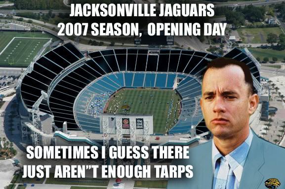
I always thought Bob Guccione designed their franchise logo. Poly Tarp Bluel, black, gold and white?


It's just the color scheme...I like them, judging from this thread though, I'm the only one...
http://forum.jaguars.com/index.php?autocom=gallery&req=si&img=2329
Teal really isnt an imposing color at all


Now THAT'S a uniform.
Teal still sucks.
They added the stripes under the arms and used a different style of numbers on the jerseys. The pants now have a cool swooping stripe (wow). The logo also has a different font. I hope I'm seeing this wrong but it looks like they have an iridescent paint thing going on with the helmet...
Their new type-face has wings?
It's the special crystals...Is the helmet metallic teal now or is it just the lighting?
This doesn't really have much to do with the uni's, but someone said something about logo's and this popped in my head..
http://sports.espn.go.com/espn/page2/story?page=snibbe/090421&sportCat=nfl
Their new type-face has wings?


Is the helmet metallic teal now or is it just the lighting?

hah... they should go back to being the bullets.
 The NBA uni's as a whole in the mid to late 90's had a cartoonish feel to them.
That cartoonish Rocket's logo ranks right up there with the Titan's logo as the worse ever in sports.
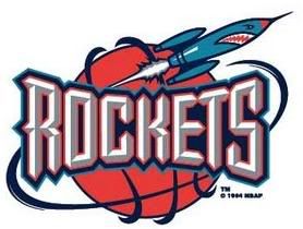
They should go back to this. I hate their current logo and unis.